EGL, Esports Gaming League, founded in 2009 in the early days of the esports industry spawned from an idea to create open esports competitions for grassroots players to compete against the best in the world. EGL has since helped to shape the esports industry into a fast-growing phenomenon and one of the most exciting spectacles to watch and play.
Esports Gaming League which is part of EEG had outsourced the website redesign prior to being acquired by EEG, they wanted to bring the project back in-house instead and that’s where the team came in to continue the redesign.
PROBLEM
The main objective for a redesign is to bring the EGL frontend user interface up to the modern-day application standard. Ultimately, EGL wants a better website to attract new and former users who would benefit from the effortless use of the website to compete regularly in tournaments.
Main areas that need redesign/improvements:
1. Improve and “modernise” the current look, whilst still keeping our core themes/styles.
2. Provide a friendlier and easier-to-use environment for players & teams. (Rounded buttons/boxes softer and less in-your-face typography etc).
3. Improve user flows, and make competing on our tournament platform as simple as possible.
4. Primary focus on the tournament side of the website, participation/matches/results etc. That is what people are there for.
5. Keep feature parity with the current website. Adding to it when/where possible, but keeping in consideration the time/focus required to build new features.
The problem with picking up an existing project is that we had to figure out the way the agency worked and how they set up the system on Figma, we found that their way was messy if we want to add more elements.
USERS & AUDIENCE
The majority of users are already using the site, but we wanted to attract more players as well as entice former players back with a new website that’s more geared towards the Esports look.
ROLES
Our team consisted of me as the Lead Designer on the EEG side, the Head of Production from EGL who designed the previous website and another product designer. Other than that we have stakeholders to who we report progress once biweekly.
PROCESS
We had meetings with the EGL Head of Production and stakeholders to understand more of the look they wanted, bringing with us a mood board to show them since they told us they did not like where the agency was heading.
Armed with more information from the stakeholders we started by looking at the processes the agency used on the Figma files, dissecting and understanding it and we set about continuing the design but at the same time updating what they have done since they had EGL branding spot on.
Let’s look at the 5 points EGL listed as problems and how we solved them:
1. Improve and “modernise” the current look, whilst still keeping our core themes/styles.
We met this issue by looking at our competitors and researching what users consider “modern” in the world of Esports, we found that live information is what makes a site dynamic and draws users, live information is information that is displayed in real-time that helps users with their time-keeping which is vital in tournaments, things like how long left to the next tournament, how much time left to register, information on how many participants in a game, user’s stats like wins and losses.
We also use more contrast to bring out the sections of the pages and colours to bring out and highlight the important information on the site. To keep styling and spacing consistent we use as much Components as we can during design process on Figma.
2. Provide a friendlier and easier-to-use environment for players & teams. (Rounded buttons/boxes softer and less in-your-face typography etc).
There were a few things we could improve to provide a friendlier and easier-to-use environment. Buttons and game thumbnails have rounded corners instead, we changed the font to something more round and softer, we changed titles from all uppercase to title case and also use less white text since we changed the background to darker grey which helps with the softer contrasts.
3. Improve user flows, and make competing on our tournament platform as simple as possible.
The current site has terrible user flow, we added a top bar with main navigation links like Games, Leaderboards, and Team Finder and also to the right side of the bar we have Messages, Matches, and Notifications for each user with notification badges notifying players of coming up matches or message from another player where the previous version doesn’t have this. This bar stays on top throughout the site providing quick access and keeping up to date with a glance. We also added a sidebar which users can customise to their heart’s content by adding their favourite games which would take them to the game page showing all tournaments available for that game.
Each tournament, game, team, and user page will have a secondary navigation to navigate around and a breadcrumb so users get a reminder of how they got there should they like to go back to the previous point.
The login and sign-up screens/modals also needed a redesign to match the new style and modernised it. Players can sign up or log in using multiple ways via other services like Twitch, Facebook etc which sped up the sign-up process and made it a simpler to join.
(Screenshots of old and new login)
(Screenshots of old and new signup)
4. Primary focus on the tournament side of the website, participation
/matches/results etc. That is what people are there for.
As mentioned in the first point about modernising the look of the site, which also targeted the primary focus of the redesign which is to improve on the tournament side, after all, that is what EGL is all about. Adding live information really give the tournament pages a dynamic feel, making them alive in a sense, I personally find that when there is a countdown I can feel myself getting mentally prepared for the start of the tournament. The overview page of the tournament should give all the information about the tournament, including prizes, where, when, check-in, support link etc. The whole tournament subpages get an over-haul and keep the check-in sidebar on the right throughout, on tablet and mobile design they stay on top, in the future, they will be sticky so the information is always there to see until the match started.
5. Keep feature parity with the current website. Adding to it when/where possible, but keeping in consideration the time/focus required to build new features.
This is a major redesign so it can be very time-consuming to implement the changes not to mention the downtime the users would experience and also the time it takes to fix any bugs.
comparison
A quick comparison of the Tournament Overview page left is the previous design and the right is new design. The new design clearly shows the sections, lists the prizes and other important information as well as the live information. The overall look is cleaner and more accessible for the users to see what they need to see immediately.
CONCLUSION
I loved working on this project, the styling is so different to sites I have designed before, collaborating with the agency and designers from another part of the company, bringing a team spirit and most importantly improving the website for the thousands of users to enjoy.
Sadly, the project was put on hold when it was 80% complete.
WEBSITE
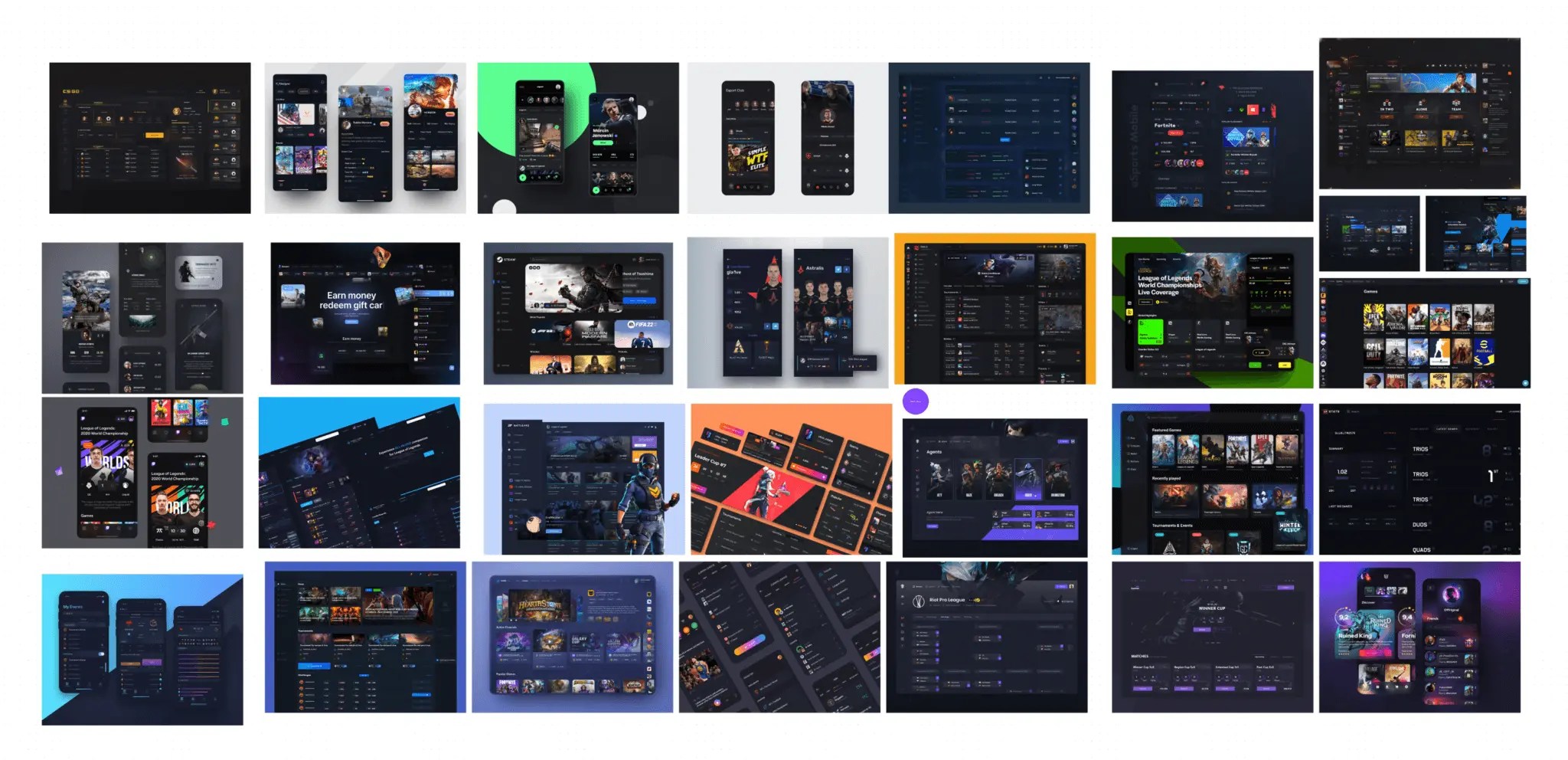
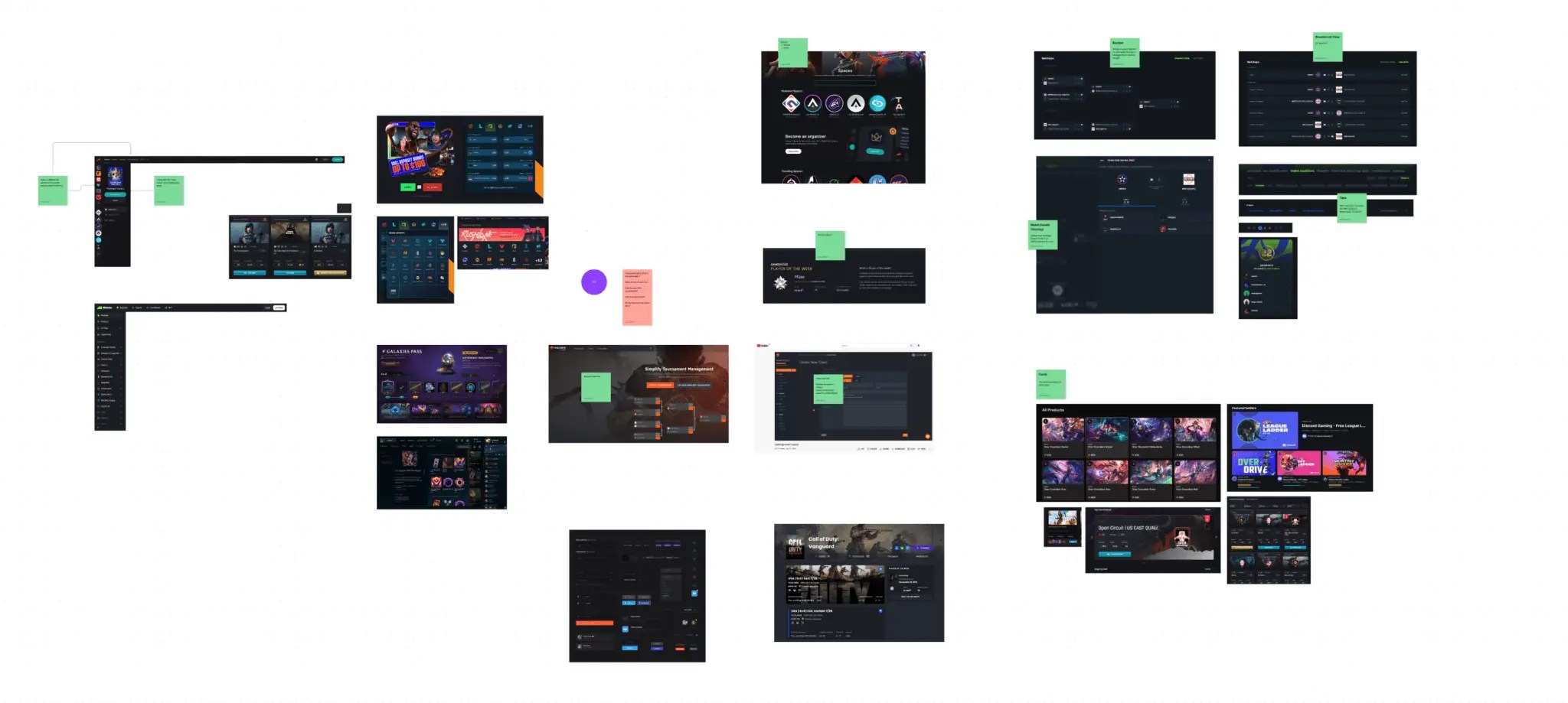
Some screenshots of the main pages that we designed on Figma namely Games pages, Tournament pages, Team Finder pages, Ranking and User pages